

How to add platform-specific icons to a Compose Multiplatform project
Make step towards native experience on different platforms by adopting platform-specific icons in Compose Multiplatform. This helps improve user experience by providing familiar elements on different devices, while still maintaining common code.
In this article, we will explore how to support platform-specific icons in Compose Multiplatform project.
If you like learning through videos, this is for you:
Setting up a Compose Multiplatform Project
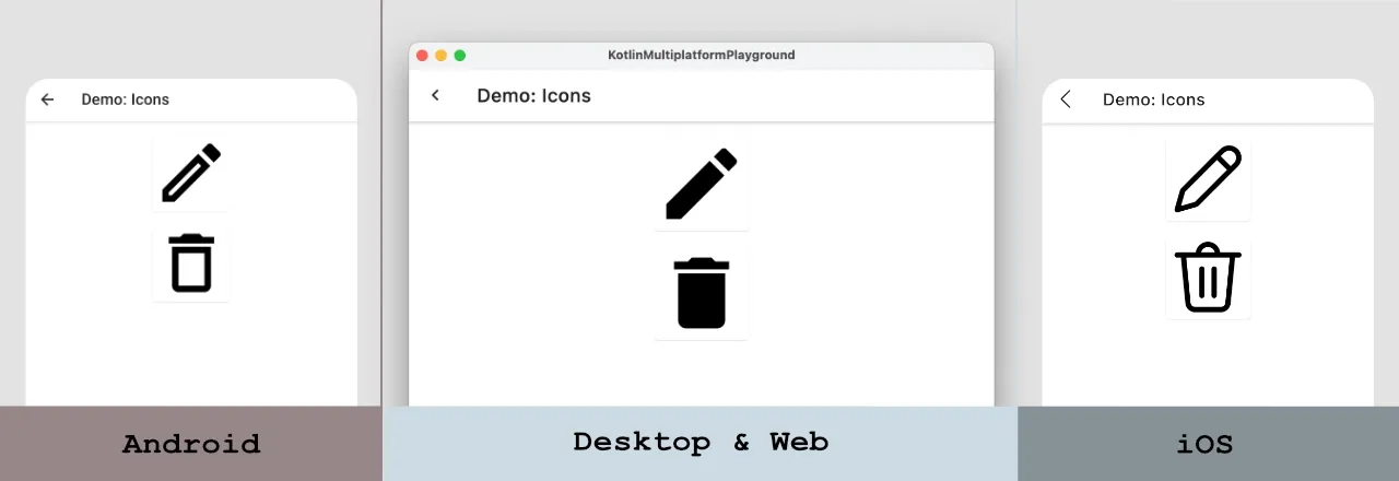
For the demo purposes, I want to have a display a separate "Back", "Edit" and "Delete" icons for the following platforms:
- Android
- iOS
- Web & Desktop
We will implement it using icons from the material-icons-core (which is part of compose dependency) and .svg icons. For iOS, we will use SVG icons that can be added to the composeResources/drawable folder. Icons for other platforms will come from the “material-icons” library.
Getting information about the platform
In the end, I want to have an icon object, which will contain platform-specific icons which I can reuse in Compose Multiplatform code. Kotlin Multiplatform provides a possibility to use expect/actual mechanism to use different implementation depending on the platform. Let's use it to get information about the platform.
sealed class Platform {
    data object Android : Platform()
    data object Desktop : Platform()
    data object Ios : Platform()
    data object Web : Platform()
}

expect val platform: Platform
Here is an implementation for each platform:
// Android
actual val platform: Platform = Platform.Android

// Desktop
actual val platform: Platform = Platform.Desktop

// iOS
actual val platform: Platform = Platform.Ios

//Web
actual val platform: Platform = Platform.Web
Creating Platform-Specific Icons
The next step is to define an icon. So, we will create an ImageVector object which defines an icon base on the platform. Let's check out the definitions for the BackIcon, EditIcon and DeleteIcon objects which provides platform-specific icons.
val BackIcon: ImageVector
    @Composable
    get() {
        return when (platform) {
            Platform.Android -> Icons.AutoMirrored.Default.ArrowBack
            Platform.Ios -> vectorResource(Res.drawable.ic_back_ios)
            else -> Icons.AutoMirrored.Default.KeyboardArrowLeft
        }
    }

val EditIcon: ImageVector
    @Composable
    get() {
        return when (platform) {
            Platform.Android -> Icons.Outlined.Edit
            Platform.Ios -> vectorResource(Res.drawable.ic_edit_ios)
            else -> Icons.Filled.Edit
        }
    }

val DeleteIcon: ImageVector
    @Composable
    get() {
        return when (platform) {
            Platform.Android -> Icons.Outlined.Delete
            Platform.Ios -> vectorResource(Res.drawable.ic_delete_ios)
            else -> Icons.Filled.Delete
        }
    }
Finally, we can use the "BackIcon" as a navigation icon of the TopAppBar, and display other icons on the screen.
@Composable
fun IconList(
    onBack: () -> Unit
) {
    Scaffold(
        topBar = {
            TopAppBar(
                title = { Text("Demo: Icons") },
                navigationIcon = {
                    IconButton(onClick = onBack) {
                        Icon(
                            imageVector = BackIcon,
                            contentDescription = "Back"
                        )
                    }
                }
            )
        },
    ) {
        Column(
            modifier = Modifier.fillMaxSize().padding(vertical = 16.dp),
            horizontalAlignment = Alignment.CenterHorizontally,
            verticalArrangement = Arrangement.spacedBy(16.dp)
        ) {
            Card(modifier = Modifier.size(100.dp)) {
                Image(
                    imageVector = EditIcon,
                    contentDescription = "Edit"
                )
            }

            Card(modifier = Modifier.size(100.dp)) {
                Image(
                    imageVector = DeleteIcon,
                    contentDescription = "Delete"
                )
            }
        }
    }
}
You can find full source code here.
Conclusion
In a Compose Multiplatform project, we can easily leverage the expect/actual mechanism to display different icons for every platform.
If you want to use material design icons, you can use the material-icons-core library, and if you need other icons, you can use the SVG files.